
Ten tips to make sure your company newsletter gets read, not tossed
by David Kandler
Editor’s Note: The author of this article, David Kandler, is the founder and president of CompanyNewsletters.com, an Internet firm that produces newsletters for companies throughout the United States. Learn more about how his firm can help your company produce printed and electronic newsletters.
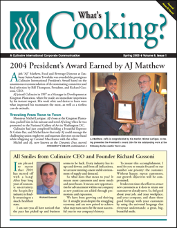
This is a sample newsletter.
Through its design and content, a newsletter needs to capture the attention of potential readers and keep it. A newsletter won’t get results if nobody reads it.
If you’re thinking of creating a newsletter for your company or if your existing newsletter needs to be revamped, here are 10 tips to make sure your newsletter gets read:
1. Make your newsletter’s name an attention grabber
Too often, editors decide to focus their newsletter title on their company’s name rather than something that might draw in more readers.
For instance, say the Grand Plaza Hotel creates a customer newsletter to attract more meeting and conference business. Most editors would choose a generic sounding name for the newsletter like: Grand Plaza Hotel News.
This title might get the attention of readers who are already familiar with the Grand Plaza Hotel, but it’ll be less likely to capture the attention of someone who has never heard of the hotel.
A much better name that would appeal to a wider segment of readers, would be Meeting & Conference Success. This name would definitely pique the interest of the hotel’s target market: meeting and conference planners.
2. Write your newsletter’s articles objectively
Although a newsletter can be an excellent vehicle for promoting your company’s products and services, it shouldn’t read like a sales brochure. By its nature, a newsletter should be a “soft” sell and provide useful information to readers. A newsletter that’s full of sales hype and propaganda will quickly be tossed by potential readers.
A newsletter’s stories should be written more objectively, like the articles you’d find in a newspaper.A newsletter’s stories should be written more objectively, like the articles you’d find in a newspaper.
Base your articles on factual information and write them as if you were a neutral third party. Instead of writing a headline that screams “Our revolutionary physician software is the best of its kind in the world,” try a more factual, third-person approach. A better headline would be: “Wyatt Technologies now produces the best-selling physician software in the world.”
Also, when you insert opinions into your stories, make them into quotes and attribute them to the proper people in your organization, just like a newspaper would.
3. Write to express, not to impress
The purpose of a newsletter is to communicate, not to see how many times you can send readers scrambling to find a dictionary. Don’t use big words when smaller words will do. Keep your writing casual, nontechnical and conversational.
When you use acronyms (CCTV, AARP, etc.), don’t assume readers know what they stand for. List them out in first reference, for instance, closed-circuit television (CCTV) and the American Association of Retired Persons (AARP).
4. Proofread, proofread, proofread
You probably wouldn’t dream of sending out a resume to prospective employers that looks unprofessional, is full of typos and contains grammatical errors. That’s because your resume directly represents your professionalism to prospective employers.
In that same way, a newsletter represents the professionalism of your company to prospective customers. You’ll want to make sure it looks impressive, has polished writing and is free of typos and grammatical errors. Proofreading, revising and rewriting are the most tedious, mundane parts of putting together a newsletter — but they are absolutely necessary.
5. Use front-page articles to draw in readers
It may be true that you can’t judge a book by its cover. But prospective readers do judge a newsletter by its cover. If the front page doesn’t contain interesting, useful articles, most people will glance at it, classify it as junk mail and throw it away without even reading one story.
If the front page doesn’t contain interesting, useful articles, most people will glance at it, classify it as junk mail and throw it away without even reading one story.
Just like USA Today or the Wall St. Journal, your front page should feature the issue’s best articles that will draw in readers.
And remember: articles that are important to your company aren’t necessarily important to the average consumer.
For instance, some companies like to put regular features such as “A Message From the President” or “A Letter From the Sales Manager,” on the front page, issue after issue.
Although putting these articles on the front page may boost the ego of the company president or sales manager, they probably won’t draw in readers unless the person has some really monumental news to announce.
It’s OK to use these types of articles, just put them in the proper place in your layout. If the president or sales manager has a message that’s less than earth-shattering, put the piece on an inside page and use a more attention-grabbing article on the front.
(Of course, if your company president or sales manager doesn’t agree, you better ignore this tip … and stay out of the unemployment line.)
6. Use at least one graphic per page
Graphics include photos, artwork, charts, pull quotes or even a colored or shaded box behind an article.
Graphics are important for two reasons.
First of all, studies have shown that people are more likely to read an article if it contains a graphic such as a photo. That’s because graphics, along with headlines, are the first things that readers’ eyes are drawn to when they turn to a new page.
Secondly, graphics within a story are important because they provide much-needed visual breaks from solid blocks of text. A page containing nothing but row after row of endless text does not look inviting to read. However, a story that contains strategically placed graphics that break up the text into smaller, less-imposing portions looks more visually pleasing and will attract more readers.
7. Use image-editing software to sharpen your photos
Few photos come from the developer with perfect contrast, color and brightness levels. If you scan photos for your newsletter, be sure to electronically touch them up before you insert them into the layout. Otherwise, they’ll probably look “muddy” in the final product.
Most image-editing software programs, such as Adobe Photoshop, allow you to adjust the contrast, color and brightness levels of a scanned photo.
8. Use accent colors and tints to make your newsletter more eye-catching
This tip applies to those who are not printing their newsletters in full color, which can be quite expensive.
To be certain, a black and white newsletter is better than no newsletter at all. However if your budget allows, add at least one accent color to your newsletter’s design. This is called a “two-color” or “two-ink” (black plus your accent color) newsletter, to use printshop jargon.
Your newsletter will be competing with colorful magazines, newspapers and other high-budget publications for your readers’ time. A splash of color on your pages will make your newsletter much more visible to prospective readers.
Also, by using tints of your newsletter’s inks, you can print more colors for no extra cost. A tint is simply a lighter shade of one of your inks.
For instance, if you have a newsletter that uses dark blue as its accent color, you could use your desktop-publishing program to color certain elements with a 50 percent tint of that ink, which would appear medium blue. A 25 percent tint of the dark-blue ink would appear light blue.
The same applies for other colors. Using red as an accent color, you could print lighter shades that appear pink. Tints of black will appear as various shades of gray.
9. Give your printshop an electronic file to print from, not paper “originals”
Instead of giving your printshop paper copies for originals, give your printshop your electronic computer file from your desktop-publishing program to print from.
Quality printshops can print directly from electronic originals, and your print quality will be immensely better than using old-fashioned paper originals.
This improved quality will translate into sharper photos and graphics, smoother tints and a crisper, more-detailed overall appearance.
10. Use recycled paper
Keep the world’s trees and your readers happy by printing your newsletter on recycled paper. Even if you aren’t a tree-hugging granola eater, I bet many of your readers are.
Unlike years past, there’s very little cost difference today between recycled and virgin paper. So there really isn’t any reason not to use recycled paper.
An important note when choosing paper: Remember, recyclable paper is not necessarily recycled paper. Also, many papers are made from small amounts of mill scraps that are recycled, but this isn’t truly recycled paper.
Instead you’ll want to use paper that is at least partially made up of previously used paper, like you put in your recycling bins. To find out what portion of the paper was made from previously used paper, ask your printshop for the paper’s post-consumer-fiber percentage. The higher the number, the more recycled paper was used. Commonly used recycled papers generally range between 10-50 percent post consumer fiber.
If you do print your newsletter on recycled paper, be sure to let readers know. Put “Printed on Recycled Paper” in small type at the bottom of your pages or in the masthead.
Read more newsletter ideas, tips and “how to” articles from CompanyNewsletters.com.
To learn more about the author’s firm and how it can produce printed or online newsletters for your company, see https://CompanyNewsletters.com or call 952/892-6943.